2 The Problem with Conventional Discussion Threads
Discussion threads are essentially tree graphs. They have a root post which can have any number of replies, each reply can have any number of replies itself, and so on. Discussion trees are usually projected to a linear structure, where each reply is displayed below the post it replies to. The next level of depth is indicated by indentation, sometimes guided by vertical rulers that provide some visual orientation.
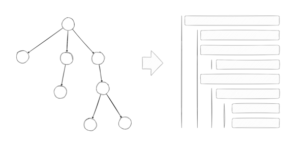
The problem with this approach is that it heavily favors shallow discussions. It discourages following threads for longer than a few levels because any coherent thread is scattered across the UI and the context is easily lost. Consider the following two examples:
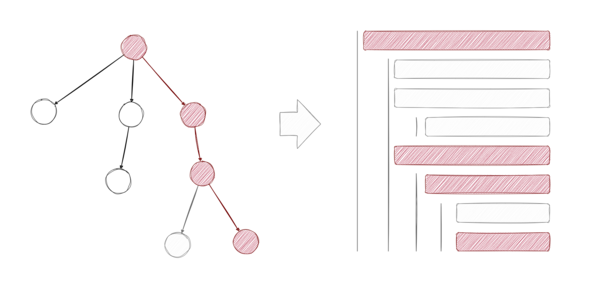
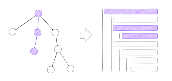
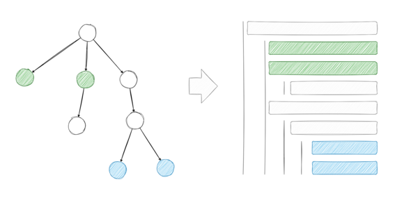
In both cases, the thread is distributed over the linear space in a way that makes it hard to follow (and this is even a tame example). On the other hand, elements that have no coherence among them (replies on the same level) are often displayed close to one another.
There are several fundamental problems with this approach:
- Breadth over depth: Threads are hard to follow because the context is lost as soon as there are several replies. This is especially true for longer threads. There is a lot less friction scrolling through the direct replies of any particular post, rather than following the discussion thread more deeply.
- Sensitivity to social cues: This setup is prone to users being influenced by social cues and it creates a favorable environment for opinion being swayed by majority sentiment rather than good arguments. Phenomena such as astroturfing and dogpiling flourish in such an environment.
- Unchecked misinformation: As people often gloss over threads getting a brief impression of what other people think about a certain piece of media, misinformation often remains unchecked. You can just post a piece of false information and it is likely read much more often than it is checked. Rebuttals cannot keep pace with misinformation.
2.1 A Novel UI to Navigate Discussion Threads
We propose a novel UI to navigate discussion threads. The basic elements of the UI are the following:
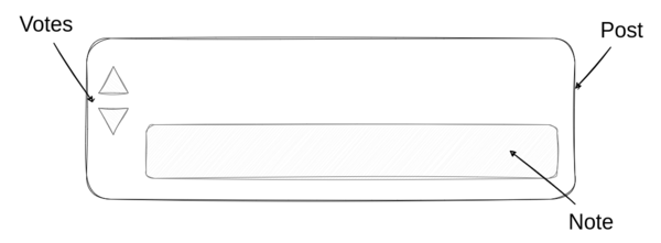
- Posts: A piece of media submitted to the platform by a user, just like posts on any other social media platform. Posts can either be top-level posts or replies to other posts, thus forming conversation threads.
- Note: A post’s top reply (we also call it a post’s note1) is a reply that is shown alongside it to provide helpful context.
- Votes: Users evaluate content through upvotes and downvotes.
The details page for a post looks like this:
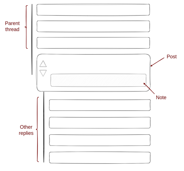
The post’s parents are displayed above it so that the context of the conversation is not lost2. Other replies are displayed below the post.
This is how the mapping between the discussion tree and the UI looks like:
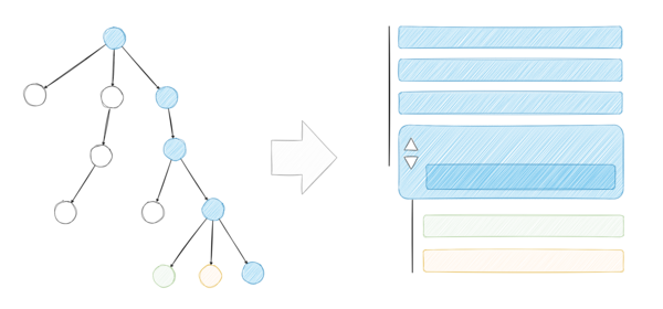
The coherence in a discussion thread is preserved and following a discussion thread is almost like reading a chat log. Navigating a discussion thread looks like this:
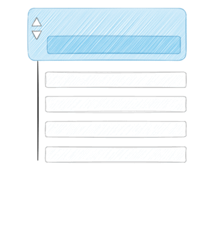
Notice that we are not displaying all replies at once in our UI. This means that we distribute more attention to certain replies than others. Other services focus attention on top replies, but only if users actually click “show replies”. This tends to cut the discussion off at the top level of the tree. In contrast our UI always prompts the user with a reply at the next level of depth, constantly encouraging users to go deeper in the discussion tree.
But this raises the question:
How do we decide which replies receive more attention and which replies receive less?